
4.9.2025
Dima Yarmolin
The ideal e-commerce analytics reports should make it easy for you to see what’s working and where action is needed. Clarity beats complexity, every time.
In this post, we’ll guide you through seven dashboards, each with its own role in helping you track performance and identify trends. It’s designed to be used as a practical checklist to enhance your organization’s analytical overview.
Read me first!
- Treat this overview as a starting point. Which combination of analyses you need will depend on the specific needs and challenges of your organization.
- We’ve intentionally avoided mentioning specific tools. We’ve instead opted to focus on concepts, meaning it’s relevant no matter what your current data stack looks like.
- You’ll also find special tags on the pictures for each section that show you at a glance which team benefits most from each report, along with the decision horizon for each of the analyses, and the analysis type. You can use this information to assign ownership and to know with whom to discuss the specifics of each dashboard.
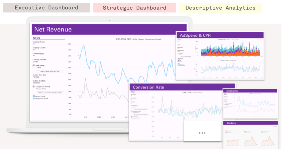
1) The executive cockpit
Track the key performance indicators of your business at a glance.
This is the front door to your e-commerce dashboards. It puts your most important numbers front and center, giving you insight in one view. This alerts you to which areas you need to discuss – retention, product, marketing efficiency, or on-site behaviour data – without forcing leadership to go through the individual diagnostic reports.
Core capabilities:
- Quickly evaluate KPI development over time and within selected categories using filters and slicing.
- Easily adjust KPIs as the business evolves: Swap or redefine metrics when you launch new channels, shift pricing, or enter new markets.
- Compare against context to support data-led decisions (e.g., previous periods, previously set targets, and forecasted values).
Slicing & filters that help to unlock insight:
- Region/market: Spot underperforming areas quickly. Check if the problem that occurred is localized.
- Channel/source: Separate marketplace, direct-to-consumer (DTC), wholesale. Compare paid traffic vs. organic.
- Customer type: Spot the differences in the patterns for each consumer category. Ensure growth isn’t relying only on a particular group of buyers.
- Date ranges: Compare the current period to the target or the previous period side-by-side.
Recommended visuals:
- Scorecards that show the current value for the metric. Additionally, include the absolute and relative change vs. a comparison period, so stakeholders can quickly spot the most essential information.
- Time & category views: Line charts to show metric development over time, and bar charts to show distribution across key categories (e.g., region, channel, customer type).
For more inspiration, check out our case study about scaling BI.
2) Customer retention analysis
Reduce churn and surface opportunities with an advanced retention dashboard.
For many e-commerce businesses, repeat revenue creates growth. A robust customer retention analysis dashboard brings together repeat-purchase rates, cohort comparisons, and renewal trends so you can quickly see when customers are slipping away, and which groups are most likely to stick around. You’ll understand not just how many buyers return but why, so you can tailor outreach to boost loyalty.
Recommended visuals:
- Cohort retention heatmap showing repeat rates for cohorts by first-purchase date within predefined time windows (e.g. days, weeks, months). Use colour to spotlight patterns, display cohort size, and revenue share in the tooltips, and allow filtering by categories, such as acquisition channel or first product.
- Retention curves: Line charts that show how repeat rate accumulates over time and where the curve flattens. Break out by channel or first product to reveal the differences and overlay current vs. previous period/target values to put performance into context.
Make it actionable:
- Craft the right retention metrics that match your needs: Setting clear rules for repeat windows and refund definitions will help your company gain a competitive advantage.
- Use flexible visuals and filters. Build the charts mentioned above with filtering options for acquisition channel/first product/market, so teams can jump straight to the view that matters for them.
- Shift budget toward sources that consistently create repeat buyers, even if customer acquisition cost (CAC) is higher.
- Keep improving. Revisit definitions and filters as your catalogue and channels evolve to keep the findings relevant to the current state of your business.
Note: Because this view is denser than a standard KPI page, add readability aids, such as a short “How to read this chart” info box, hover tooltips with plain-language metric definitions, etc.

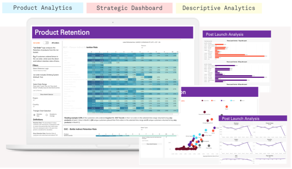
3) Product launch & product retention
Track and evaluate the success of your products from day one.
This report tracks a product’s journey from launch day through its entire lifecycle so you can compare new releases side by side and see which ones keep customers coming back. You’ll uncover the early wins and long-term performers and can use that information to shape upcoming product decisions.
Core capabilities:
- Like-for-like benchmarking: Compare each new product to past launches from the same category/price/season. Track sales patterns over time, contribution margin, and flag things like sales/promos, so the comparison stays fair.
- Product retention analysis: Identify which products create loyal customers. Measure second-order rate, time to second order, average order value (AOV), and return rate to spot your true best performers.
- Portfolio optimization: Turn findings into clear actions, e.g. adjust bundles, pricing, or placement if it cannibalizes other products.
Recommended visuals:
- First-product retention curve: Repeat rate over time for customers whose first order included the new product vs. similar prior launches.
- Comparison bars: AOV, return rate, and second-order rate for the new product vs. products within a similar category.
- Launch curve line chart: Cumulative units/revenue by date since launch.
4) Recency, frequency, and monetary value (RFM) & customer lifetime value (CLV)
Understand the actual value of your customer and act to maximize it.
Not all customers are equal. This dashboard categorizes buyers by recency, frequency, and monetary value and adds predicted customer lifetime value (CLV) where applicable, so you can focus on the segments that matter most. You’ll see which customers are high value, which are slipping away, and where to invest for maximum return.
Recommended visuals:
- RFM heatmap grid: Visually shows the relationships between recency, frequency, and monetary values. Include more information by adding tooltips with relevant information.
- CLV distribution plot: Presents how predicted CLV is spread across customers. Highlight the median and key percentiles so that the long tail and outliers are obvious. Let users overlay or filter by acquisition source/campaign for comparison.
Make it actionable:
- Improve your customer engagement strategy by accurately predicting customer value and segmenting your customer base based on their purchase history & forecast.
- Utilize the CLV analysis to improve your sales forecasts and tailor your outreach efforts to specific customer segments by feeding customer data into targeted channels.
- Drive sales and build long-term customer relationships with this data-driven approach.

5) On-site & shopping behavior
Increase your conversion rate and volume by understanding visitor behavior and optimizing the customer experience.
This overview maps how visitors move through your site from entry points to checkout, so you can spot where they hesitate or drop off. You’ll see traffic sources, page-by-page journeys, and conversion hotspots together with classic web traffic metrics that guide you in smoothing the path to purchase.
Relevant slicing & filters for the view:
- New/returning visitors
- Traffic source/campaign
- Landing page
- Device/browser
- Events triggered during the session
Recommended visuals:
- Funnel chart with drop-off %: Shows on which step of the path people leave the most frequently (e.g., Add to cart → begin checkout → purchase).
- Traffic by source: Sessions/users split by source/medium or campaign. You’ll spot mix shifts after campaigns, seasonality, or tracking changes, and see which channels bring the most people to the site.
- Scorecards: Put the most critical web traffic metrics on a card to spot quick findings.
Note: This view only works if your tracking and web data collection is robust and reliable (e.g., consistent UTMs and IDs, clear traffic filters, aligned attribution windows, GDPR-compliant consent). If these basics aren’t in place, the charts can be misleading.
Take a look here to see how our experts can help you with this foundational work or assist your CRO or UX team with their expertise.

Here are a couple of related case studies to help you with this topic:
Hugo Boss case study: Minimizing data difference, maximizing data quality
Insurance company: Improving data quality with a digital analytics audit in the insurance industry
6) Marketing performance & efficiency
Boost your ROI with a 360° view of the performance and efficiency of your marketing channels.
This report brings together spend and return data from all your channels in one place so you can judge cost against revenue immediately. You’ll track metrics like return on ad spend and cost per acquisition alongside overall campaign results. Clear performance breakdowns help you to:
- Maximize the ROI of your marketing efforts by consolidating, aligning, and evaluating performance and cost data from all your digital channels.
- Use this information to make informed decisions about budget allocation and optimize the performance of your channels.
- Streamline your marketing efforts with a holistic, automated overview of all your channels. Drive business success by maximizing the effectiveness of your marketing strategy.
Treat this dashboard as an ‘Executive cockpit’ of the marketing department. Include all the relevant metrics in the form of scorecards showing the percentage change against the comparison period, present the development over time using line charts, and add overview tables, so that the report users can also download relevant data if needed.

Here are some related case studies as inspiration for you:
Accessible and actionable marketing data in one source of truth for bexio
Using Tableau to create a customized dashboard for visualizing marketing campaign performance
7) Influencer marketing analytics
Understand and optimize your influencer marketing efforts.
This report ties influencer activities directly to site traffic, their costs and sales so you can see which partnerships pay off. You’ll track click-throughs, conversion rates, and long-term customer value from each creator. With clear comparisons and trend lines, you can:
- Maximize the impact of your influencer marketing campaigns with in-depth insights into the behavior of visitors coming from these efforts.
- Understand which influencers are driving the best results for your business and how these results evolve.
- Use this data to optimize your influencer marketing strategy and drive success for your business.
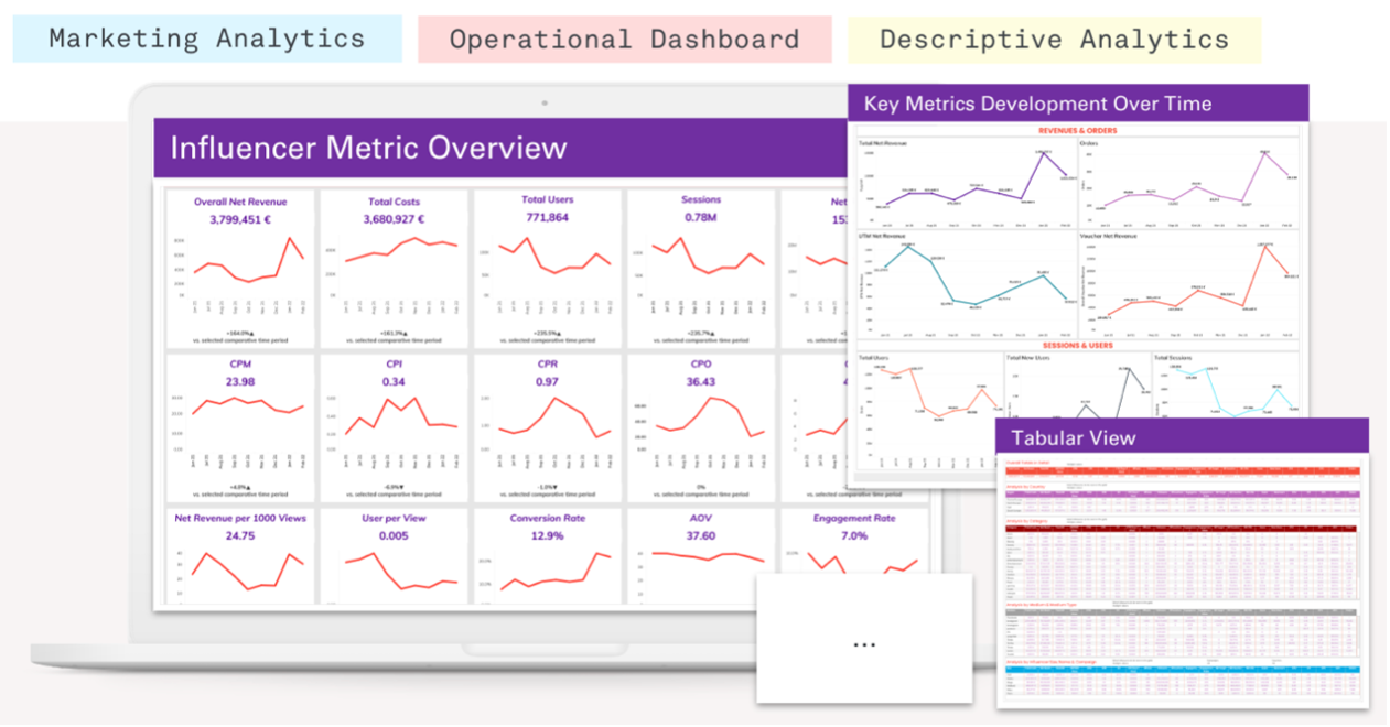
Related case study: A uniform platform for all social media dashboards
Steps to consider during the implementation
- Stabilize data foundations: Unify sources, definitions, and identities to build one single source of truth for e-commerce data.
- Start with the executive cockpit and marketing performance, the two dashboards that most e-commerce businesses rely on daily.
- Add retention, RFM/CLV, on-site behaviour, product launch, and influencer marketing analytics as your business needs evolve.
- Document metric definitions and create a report ownership map.
- Track outcomes back in your e-commerce dashboards.
Ready to upgrade your reporting toolkit?
Whether you’re looking for support with a specific dashboard, guidance on aligning on metric definitions, or a second opinion on your current setup, FELD M is here to help. Get in touch with our data team to explore how we can support your goals.