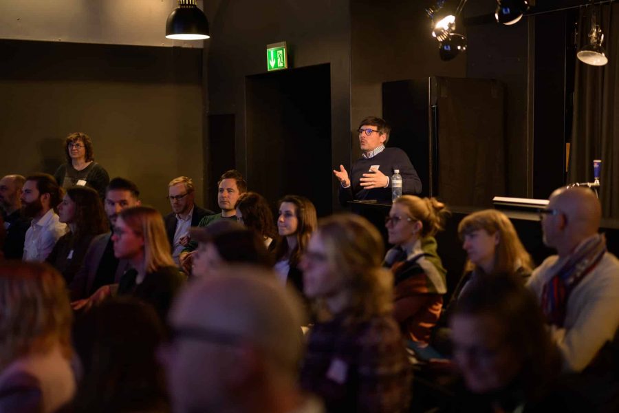
This year, FELD M participated for the third time in the “SHIFT – Conference on Digital Ethics”, which took place on 20 April at the X-TRA in Zurich/Switzerland. After two digital conferences, the approximately 220 conference participants were able to discuss in person again this year. The conference featured numerous high-profile speakers who presented their expertise and practice-oriented perspectives on the most pressing ethics issues of digitalisation; in several breakout sessions, individual topics could be analysed in more depth and interactively.

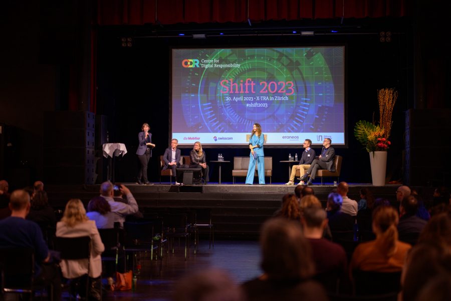
The initiator and host of SHIFT Cornelia Diethelm (left), the closing panel and the moderator Patrizia Laeri (centre). (c) Photo: Louis Rafael Rosenthal.


The topics of this year’s SHIFT conference

The discussions focused on the challenges and opportunities presented by the rapid technological advances of recent years and months – above all, of course, artificial intelligence and machine learning, robotics, manipulative design patterns on websites and apps, but also the representation of artificial intelligence in the media or the increasingly important topic of face recognition. Sustainability as a competitive advantage was also discussed, as was the controversial AI Act. Of course, data protection was not neglected either, as it forms the interface between corporate compliance and corporate ethics in many companies.
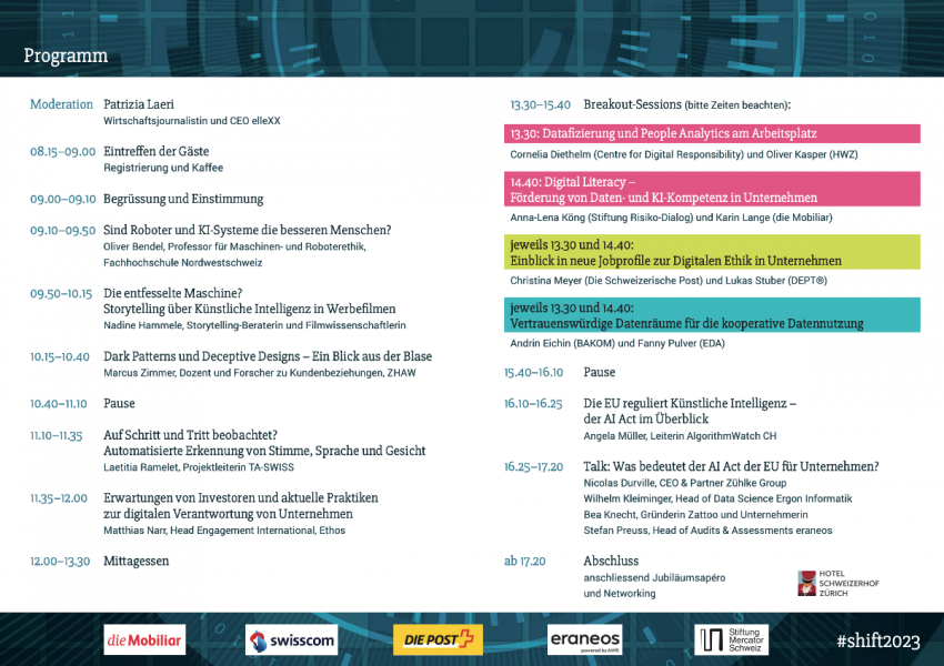
The Programme.


The take-aways for FELD M

At FELD M, we have been dealing with digital ethics topics for several years – from AI ethics to data for good to dark patterns in consent management and to technical solutions for clean data sharing. It was therefore all the more exciting that we found our views partly confirmed, but also partly confronted with surprising insights.

Digital Literacies

AI-literacy, data-literacy, tool-literacy and privacy-literacy are only a few of many literacies, i.e. competences that should be part of the basic skills of every person working in digital (or non-digital!) professions in the 21st century. After all, we all come into contact with new technologies in one way or another. We need to be able to assess what consequences the use of “artificial intelligence” has on their (working) life. We have to be able to read diagrams and tables. This was shown not least by the Covid19 pandemic. We need to know how data is collected and used so that we can either use it as a basis for data-driven decisions at work or to protect ourselves from data misuse in our private lives. We need to be able to deal with different applications: understand how to use them, where they try to trick us, how to get applications to do what we want them to do, or how to prevent exactly the opposite from happening. This also includes a conscientious impact assessment when using digital technologies.
These literacies were mentioned again and again in the keynote speeches, and even away from the official conference programme, there was lively discussion about how these literacies can be strategically and consistently promoted among the population, but especially in companies. With its services, FELD M helps many clients to work in a more data-driven way, but for this to happen, companies need the aforementioned literacies that enable a data-driven organisation in the first place – even before deciding on the appropriate tool stack or the best tracking setup.

Dark Patterns and Deceptive Designs

At least since the appearance of consent banners on all websites, everyone has had to deal with so-called dark patterns – manipulative techniques that make it unattractive NOT to give consent to data processing. Through misleading wording, many banner levels that you would have to click through to object to the processing, or through visual highlighting of options that are good for the companies but rather bad for the privacy-savvy users. (You can find a dedicated article and whitepaper to download on our blog, introducing some of the most common Dark Patterns in Consent Management.) However, these manipulative design patterns are not only found on consent banners, but also on travel portals, where it is regularly displayed that there is only one room left in the selected category and that you should therefore rather book very quickly.
A study was presented at the conference that brought surprising insights: most people do not perceive the manipulation as bad at all, but rather mentioned praisingly, for example, that a transport insurance with costs was smuggled into the shopping basket when shopping online. What the findings of this study mean will have to be discussed. What is clear is that digital literacy needs to be addressed here as well, so that people are informed enough to recognize when they are being manipulated.

Data Rooms and Data Sharing

Trusted Data Centres, Trusted Data Services, Data Clean Rooms, Data Rooms and Data Sharing – if you think you have lost track of these terms, you are not alone. The terms have been appearing with increasing frequency for some time and a clear definition is difficult – also because fundamentally different concepts can lie behind them and in part highly complex technologies such as differential privacy are used. Established use cases and practical examples are also difficult to access at the moment.

At FELD M, we have developed a common understanding of the technologies, also because they can be used by our clients to compensate for a poorer data basis due to ad blockers or low consent rates in consent management. A detailed breakdown would go too far here, but we took away from the conference that there are numerous public efforts in this area that could provide standards and the necessary security for data sharing in the future. It is important to continue to follow these developments.

Our colleague André Hellemeier in one of the Breakout-Sessions.

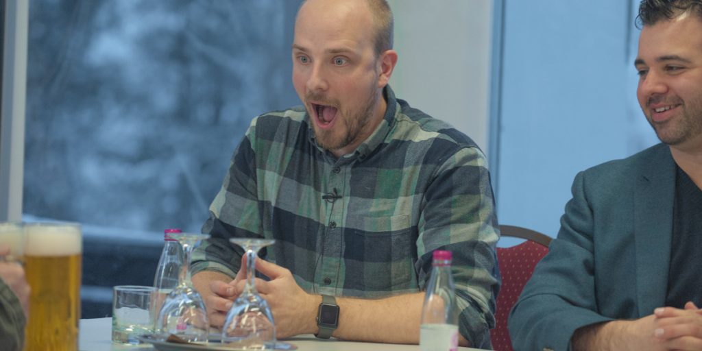
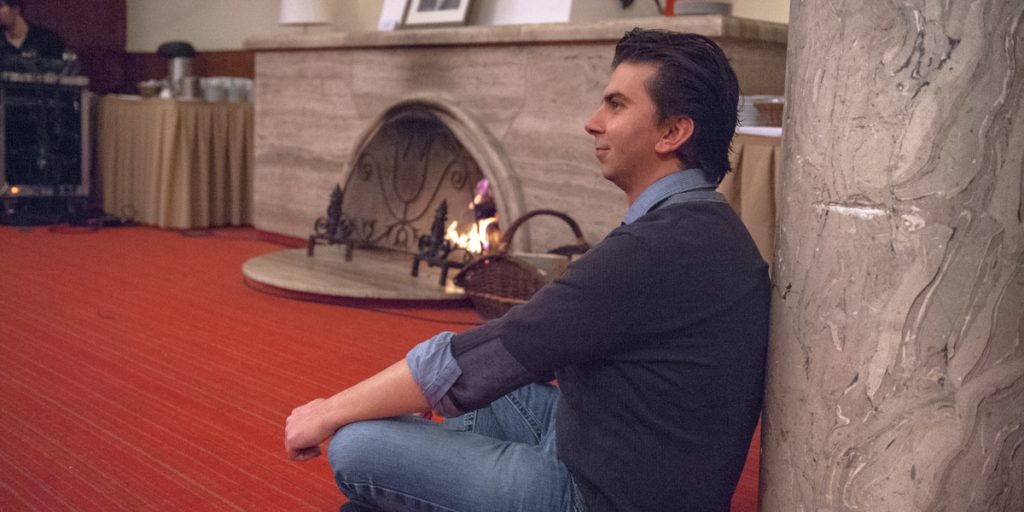
Our colleague André Hellemeier in one of the Breakout-Sessions. (c) Photo: Louis Rafael Rosenthal.


Conclusion

We have only selected a few exemplary topics that are directly related to our work at FELD M and to what we are currently dealing with on a strategic level. The conference has established contact with other experts who are confronted with the same problems and has made it possible to compare our own ideas and developments with those of other experts. This comparison with different perspectives is crucial for a technological-ethical compass to be able to adjust itself again and again and in the best possible way. In 2024, we will continue to look for new perspectives, innovative ideas and new insights at the Shift, because “machines” – in the broadest sense – penetrate and determine our lives more and more and therefore need morals.


If you have any questions or want an exchange about the topics of data ethics and corporate digital responsibility, our team is happy to hear from you: data-ethics@feld-m.de.

You want to stay up to date on these topics and see how we put digital ethics into practice? In our FELD M Newsletter, we provide (ir)regular updates & information on a wide variety of topics of our and our client’s day to day business. Subscribe here!

For all those who have wanted to take their first steps with Tableau for a long time, but have not yet been able to do so: Next month is your opportunity!

We are looking forward to holding a “Tableau Test Drive” session next month on 17.09.2020 . This will be your opportunity to do first analyses, create first charts, etc… and all this under the guidance of experts who have been working with Tableau for years.

Due to the current situation regarding Covid-19, this workshop will take place virtually.

The participation is free of charge.

Please note: The workshop will be held in English.

You can find all further information and the registration here.

Thomas and Erik are looking forward to meeting you !

For all those who have wanted to take their first steps with Tableau for a long time, but have not yet been able to do so: Next month is your opportunity!

We are looking forward to holding a “Tableau Test Drive” session next month on 25.06.2020 . This will be your opportunity to do first analyses, create first charts, etc… and all this under the guidance of experts who have been working with Tableau for years.

Due to the current situation regarding Covid-19, this workshop will take place virtually.

The participation is free of charge.

Please note: The workshop will be held in English.

You can find all further information and the registration here.

Lama and Erik are looking forward to meeting you !

For all those who have wanted to take their first steps with Tableau for a long time, but have not yet been able to do so: Next month is your opportunity!

We are looking forward to holding a “Tableau Test Drive” session next month on 20.02.2020 in Bern, Switzerland. This will be your opportunity to do first analyses, create first charts, etc… and all this under the guidance of experts who have been working with Tableau for years.

The participation is free of charge.

Please note: The workshop will be held in English.

You can find all further information and the registration here.

Lama and Erik are looking forward to meeting you personally in Bern!

Hi, I´m Linda. I am part of the Data Science team at FELD M and was excited to participate this year’s useR!2019 conference, which took place in Toulouse.

That meant 4 days full of great

  • 3h tutorials
  • keynotes
  • 30 min blocks of 6*5 min lightning talks
  • 1,5h blocks of 5*18 min talks
  • sponsor talks
  • poster session
  • social events, …on up to 6 parallel tracks!

The complete list of talks including slides can be found here http://www.user2019.fr/talk_schedule/ and video recordings of the keynotes here: https://www.youtube.com/channel/UC_R5smHVXRYGhZYDJsnXTwg/videos. The video recordings of all talks are uploaded here: https://www.youtube.com/channel/UC_R5smHVXRYGhZYDJsnXTwg/videos.

Let me tell you about the conference’s input as I guide you through a typical project’s timeline. I took advantage of a nice Machine Learning Workflow Hexa-Diagramm and added a 6th Hexagram, adding ‘Communication’ of projects.

Let’s go through the 2nd, 3rd and 6th Hexagon to give some examples, what I took with me from useR! and where we now are taking some deep dives to improve our workflow.


  • {tidyr} by famous Hadley Wickham (a must read for everyone advancing in R is his recent 2nd edition of “Advanced R” book: https://adv-r.hadley.nz/index.html) is updated. In the area of web analytics we, at FELD M, receive raw data, in which all touchpoints of all visitors/customers are recorded in rows. In order to analyse customer journeys, we need to reshape our data, so that we have the customers in rows and all touchpoints per customer, i.e. the customer journey in another column. The transformation of reshaping the data from long format to wide format is therefore a regularly used transformation in Data Science projects. The current functions to reshape data are spread() and gather(), where many R-users had to struggle with the logic. So, Hadley Wickham showed us the work in progress functions pivot_longer() and pivot_wider(), with a more intuitive function and arguments name to reshape data. https://tidyr.tidyverse.org/
  • When working with large data sets we usually use either data.table or SparkR (which we currently prefer over sparklyr because of its more similar syntax to PySpark and hence easier switch between Python and R). The latter two methods rely on RAM for their performance. Since our datasets often don’t fit into the RAM anymore but are still below real big data (calculations can’t be handle by a single machine anymore), the newly developed package {disk.frame} (https://rpubs.com/xiaodai/intro-disk-frame) offers an interesting possibility to store and process medium sized datasets. Data larger-than-RAM is split up and stored in chunks on the hard drive and {disk.frame} provides an API for manipulating these chunks. Unlike Spark, {disk.frame} does not require a cluster and can use any function in R.
  • Before we build a model, we first analyse the data on a descriptive level to decide what assumptions we make to build a model. Visualizing high-dimensional data can then be a cumbersome task. In a tutorial Di Cook showed us her packages like {tourr} https://github.com/ggobi/tourr, which visualizes higher-dimensional (>3) data in an animated rotation. You can take a variable and rotate it out of the projection and see if the structure persists or disappears. The package {nullabor} https://github.com/dicook/nullabor is a tool for graphical inference. Your data plot will be displayed among several random nullplots (plots representing your nullhypothesis). If the difference is visible, there is probably a statistical significance in the structure of the plot.
  • Due to the individual advantages of Python and R, at FELD M Data/Software Engineering is mainly done in Python, while the analysis (building models, statistical tests) by the Data Science Team is more focused on R. Our Data/Software Engineering- and Data Science Team is already working very closely together on Advanced Analytics projects to take the advantage of both expertises and both languages (Python and R). Of course, it is in general our goal to build our (data) products in one programming language. Nevertheless, sometimes we build prototypes, which have to live in both worlds and require to use both languages. The {reticulate} package https://rstudio.github.io/reticulate/ makes it possible to call Python out of RStudio. Rounded off by the GUI developments of knit Rmarkdown, it will be easier to bridge language silos.


  • When it comes to building a model, it is always important to know the cause of a variable, as we all know “correlation != causation”. Under the assumption, that causal relationship leaves a structure in the data, there are many procedures that detect this causation. Causaldisco summarizes the causal discovery procedures in R and filters the appropriate procedures for your data when you choose your properties. http://biostatistics.dk/causaldisco/.


All in all, the success of a project depends not only on the methods, such as those mentioned above, but also on the environment you create in your company. Julie Lowndres showed us in her keynote (https://www.youtube.com/watch?v=Z8PqwFPqn6Y&t=2806s) how she and her team work by embracing open data science, openness and the power of welcome.

FELD M is looking forward to taking some deep dives into the learnings listed above and to putting them into practice to improve our workflow and smoothen the journey for our customers.

If you are interested in our work, feel free to check out the data science and engineering services that we offer.

As part of Data Science for Social Good, we not only offer our Data Ambulance (https://www.feld-m.de/en/data-ambulance/) for non-profit organizations, but also regularly take part in hackathons, datathons and similar competitions (R Conference, Kaggle, …). In 2019, we took part in the Europe-wide EU datathon for the first time and developed an application on the subject of climate protection.


The EU Datathon and our challenges

This year’s EU Datathon (https://publications.europa.eu/en/web/eudatathon) included three different challenges and we immediately knew that we wanted to deal with the topic “Tackling Climate Change”. The competition’s objective was, besides an innovative idea, the use of several open data sets provided by the different EU institutions. The evaluation was based on the following criteria, among others: Relevance, open data use (novelty, scalability and updates), the solution itself (problem description, data science, maturity, ongoing benefits for the target group, sharability, …) and the project plan.

In addition to combating climate change, it is also important to us to point out the benefits of open data. Data transparency is one of the cornerstones of the Open Data movement and ensures integrity and scientific working methods as well as versatile use of the data. It is only through exploitation that data obtains its value, and the better the access, quality and granularity of the data, the more detailed models and simulations can be built and their value-generating potential increased. Important sources include the EU Open Data Portal (https://data.europa.eu/euodp/en/data/), the UN (http://data.un.org/) and the World Bank (https://data.worldbank.org/).

An App against Climate Change – Data-based Education for Schoolchildren and Young Adults

Our idea: Education is our strongest weapon in the fight against climate change: understanding what the causes are, what effects it will have on our planet and what one can do oneself against it. That’s why we wanted to explain climate change to students in a simple way, using vivid examples of soil, air, water and biodiversity.

Greta Thunberg described the importance of education and why we need to act now most accurately:

Let’s get this application started: Our approach according to Design Thinking

With a small team, we have been developing our web-based app over the last few weeks, which aims to explain climate change to students on the one hand, but also to encourage them to become active themselves on the other.

In the implementation we oriented ourselves on the Design Thinking Process and began by conducting interviews with our target group and experts as well as extensive desk research. We became aware that this project would of course focus on the integration of data, but to an even greater extent on the curation of suitable, explanatory texts. Data literacy is certainly also an important aspect. How can we train our understanding of data and the interpretation of tables and visualizations? This is a recurring theme in our daily work with data (https://www.feld-m.de/en/service/dashboards-visualisation/).


Clarify with data: What our app shows exactly

Our analyses in our prototype combine data on EU-wide historical emissions of greenhouse gases and corresponding forecasts for the coming years. The shares of different sectors, but also the shares per capita and country in the total emissions are visualised. In addition to the extreme weather conditions observed in recent decades, we have also calculated how the sea would spread with predicted sea level rises by extrapolating sea level rise models on to the coasts of Europe. For this purpose, Voronoi cells were calculated around the projection data points, the sea levels divided into bins and mapped on to a topographic map. In addition to the analyses, we have also collected various options on how to become active and what the current outlook is if we do not set ourselves more ambitious goals.

You can find our current prototype here (so far only developed for desktop and tablet): environ-mate.feld-m.de


Technical details and data protection

The application itself is client-based (no backend required) and therefore highly scalable (JS libraries such as Leaflet, Spectre and Vue were used for this). Furthermore, the application is GDPR-compliant and available in German and English. We plan to add more languages in the coming weeks.


The result: Fourth place in our group at the EU-wide Datathon

From 99 EU-wide project ideas we were chosen to present our project in the final in Brussels. Last week it finally happened and we presented our results together with 11 other teams (four per Challenge) in short 10-minute presentations. We took fourth place in our Challenge and would like to thank everyone for their positive and constructive feedback over the last weeks. The EU Datathon 2019 was well organized (in advance as well as the final conference).

Special thanks for the support go to our colleagues who had our backs and supported us in implementing the project. At this point we would also like to congratulate all the innovative project teams who put a lot of heart and soul into their projects!

The recording of the entire conference can be found here: WILL FOLLOW AS SOON AS AVAILABLE


Future ahead: How things will continue

We firmly believe that our app can deliver great added value for many people. Our project does not end with the datathon; we intend to carry out user tests with students and ask a climate expert for further input. In addition, we are looking for other comrades-in-arms who believe in the good cause and want to support us in our future development. Of course we will also look for funding or sponsors for our concept. Just write to us at Datenambulanz@feld-m.de if that sounds exciting to you.

Just like previous years, we’re happy to say that the Tableau conference was definitely worth the time and money spent. The conference was held at the Estrel Hotel & Congress Center in Berlin, and about 2,000 data enthusiasts came together for three days, and it was truly a pleasure for us to be part of this amazing community!

and oh yeah, this is us 😊:


The first day of the conference went quite smoothly, as our team spent the day working on actual data with Tableau, both for the Makeover Monday session and the “Sports Viz” semi competition session. In case you don’t know what Makeover Monday is, it’s basically a learning community which provides you with fresh data every Monday, so you get to work on them and create cool dashboards for your own personal development. You can check out their website here: https://www.makeovermonday.co.uk/.

And now let’s get to the sessions! From this section, we’ll sum up the key takeaways from the most interesting sessions we attended from our viewpoint. So here we go! 😊


Key Note: All about Data Language and Data culture

This year’s keynote speech mostly focused on the necessity of establishing a data culture at organizations, through “language”, “sharing” and “adaptive” systems.  Basically, we want everyone to be able to distinguish fact from fiction, and we can only reach this aim by encouraging everyone to “talk data”, and spread the “data language”. Well I guess we could all agree on this, and acknowledge the fact that in a few years, everyone would and should be able to read and understand data, and therefore, there would no longer be the need for separate “analyst” roles to fill in the gaps in organizations.

But let’s get to the big question which we were all waiting for: “Why was Tableau acquired by Salesforce, and how would that affect the future of Tableau?”, and here is the answer we got: Tableau would still be working independently from Salesforce, and the CEOs would still remain at their positions. Most importantly, Tableau will not divert from its initial “vision”, which is helping people with seeing and working with data. They confirmed that Tableau will always focus its activities towards this direction, and assured us that the collaboration with Salesforce would even reinforce Tableau’s activities towards achieving this goal.

They also introduced the great new feature “Ask data” in the 2019.2 version: it is amazing how anyone can now ask Tableau almost anything they want and Tableau will automatically visualize the answer to their question.

Furthermore, “Explain data” was also introduced, which basically helps users understand the “why” of data. This is available in the tooltip, and as an example you are then able to see outliers and filter them out of your report.


Getting People To Use Dashboards

Ok so here’s the key takeaway of this session: If you want users to actually “read” your report and engage with it, you need to put it in the right “context”. So having the best design or choosing the most suitable charts will not necessarily lead to user engagement, but the right context will. So how do you develop the “right context” for your reports? Make it personal. Think of the user who is going to check the report, and make it personal for them. Answer the question “how am I doin?”, and let them compare or relate the data of themselves to others. Let’s say it’s a demographic report: show them where they stand comparing to the rest of the population.


Turn Data into Products | The Whys, Whens, and Hows of Embedding Tableau

Who does not love to see their dashboard in their own website with 100% control on its layout and design? This session was of high interest for us as we recently started using the embedding functionality of Tableau, and very useful best practices from authentication and user security to design and layout were presented. We learned a lot in this session and will bring it to practice in the coming future.


Surprise Me | Creating Advanced and Unique Charts

Amazing session full of inspiring art with numbers. Our key takeaway is not only that we learned how to visualize the Tableau logo with Tableau, but also how to build multi-layer radial charts and how to use Sigmoid & Logit functions to create Sankey diagrams. It is impressive how much information one can get from one sheet. Dual axis not enough? Use multi layers and get as many axes as needed, the secret is to build the data smartly. We cannot wait to bring these smart graphics and ideas in practice.


Tableau extZENtions | The What, Why and How’s of Extensions for Tableau

Great inspiration to use extensions! This session simply showed us that when combining Tableau with different extension APIs, the sky is the limit. The introduction of Data Village Online was also truly exciting, allowing users to modify data and write back to data base is a huge advantage that makes the use of Tableau even wider. We are very happy to see the increase of the use of extensions. We have used many extensions in the past and will surely be using many more in the future.


Tableau Ambassadors | The Rock Stars of the Tableau Community

After 3 days of intensive learning the best way to say goodbye was to meet the actual Tableau heroes. Thanks to people like Lorna, Simon and Sarah’s extraordinary input to the Tableau community, one can find an answer to everything online when it comes to Tableau. It was a pleasure to meet them in person and hear their side of the story.


We hope you found this review useful, and hope to see you there next time! (of course, we will be there again next year 😊).


TC Europe 2019 is less than two weeks away and we´re thrilled about the upcoming breakout sessions and keynotes. From June 17th till June 19th, three of our colleagues will be part of hundreds of data enthusiasts flocking together in Berlin to get their fix on the latest developments in Tableau and to further deepen their expertise in working with Tableau´s tools. The Tableau conferences we´ve visited over the last years have had their fair share in sparking new concepts and ideas that have been crucial to various projects we worked on with our clients. Therefore, we can´t wait to see what will come out of this year´s conference!

What we´re looking forward to the most

With Embedded Analytics being a topic requested by our clients more and more often and first projects already in development or near finalization, we´re very excited for the breakout session Turn Data into Products | The Whys, Whens, and Hows of Embedding Tableau. We´re hoping for some food for thought which might help us in advancing our existing concepts and to serve even more analytical use cases in the future. Having the opportunity to get insight into further embedding use cases in the breakout session Embedded Portal Applications at Deutsche Bahn AG will spark even more ideas.

With Data Science for Social Good being a topic in which we have increasing interest, we were more than happy to find the session Viz For Social Good in this year´s conference schedule. We´re very much looking forward to meeting like-minded people who are trying to put their analytical expertise to use for a good cause! You can find out all about Data Ambulance, one of our first offerings related to Data Science for Social Good, here: https://www.feld-m.de/datenambulanz/

Adding visualizations to tooltips with the release of Tableau 10.5 has been a true game changer. Our dashboards have never been more clean and sleek (with secondary charts being moved into the tooltip), and never before have our clients had so much information at their fingertips (or cursor). The Jedi level session Next-Level Viz in Tooltip will highlight ways to get even more analytical value out of this feature by making it even more interactive, drill-able and more. We can´t wait to hear about all of that.

With our clients and – in Tableau related projects – our dashboard users being the center of our attention, we´re interested in finding even better ways to make data more accessible and meaningful to them, creating solutions which allow them to derive valuable insights and drive their businesses. Therefore, we are happy to attend a variety of sessions focusing on dashboard adoption, balancing data governance and self-service, and more: The Secret to Getting People to Use Dashboards, Avoiding the Flatline | Building an Analytical Culture at Your Organisation and How to Build Your User Community and Boost Adoption (to name just a few) will serve that purpose more than well; we´re sure of that.

Are you attending TC Europe as well?

We´d be more than happy to have a quick chat in between sessions and talk about your visual analytics related use cases! Are you using the Tableau Conference App? Just search for attendees of FELD M and shoot us a short message.

Not attending TC Europe? You can find out about our services related to Tableau and other BI-tools here: https://www.feld-m.de/service/dashboards-visualisation/

Superweek 2019 – this 5 day long digital analytics conference on a mountain top in Hungary was quite an unique and for sure very intense experience. I’m still a bit overwhelmed by such amount of great lectures and chats in between them. Not easy to put all my thought on the paper, but let’s give it a try. If you want to know how not to “puke with data”, what’s new in Google solutions and how to dance GTM Boogie, then please bear with me :).

Big topics: Big Query, Machine Learning and automation

After these few days, I had the feeling that nobody uses the Google Analytics interface any more. Sending data to BigQuery, playing around with BigQuery ML, visualizing with Data Studio – it’s now not only common but an obvious approach. This solution provides data quality and flexibility for advanced users, who don’t want to be limited by the tool. Traditional interface remains there to ensure data is easily accessible, however, we should still aim to go beyond it. The topic of machine learning and automation was mentioned numerous times, and it definitely is the future of analytics and digital marketing. Predicting conversions in order to define audiences, personalization of the website or gaining new insights were parts of the few presented solutions. My favourite case was presented by Zoran Arsovski and Ivaylo Shipochky. These guys used business data feed to automatically create and update ads for sport events, and then used trained models to run the campaign – minimizing workload and boosting revenue in quite impressive scale! Still, Mark Edmondson, showed us that machine learning alone cannot provide the same value as an expert in the field. Yet, as ML is getting more and more accessible (thanks to solutions like Cloud AutoML) combinations of these two can now offer whole new level of quality.

Simo Ahava uwielbiał drinki z paneli GTM na Superweek.
Simo Ahava loved the GTM Panel drinks. Photo: superweek.hu

Business Consulting, Cooperation and Processes

Ivan Rečević said, “we prefer to stay in the friend zone of technology, as we are afraid of serious business relationship”; “We are puking with data for 4500 years now” Sayf Sharif followed, while showing the first monthly report from ancient Egypt. Even though our work will always have roots in proper implementation (and as Brian Clifton showed, there’s still a lot to do: https://verified-data.com/study), digital analytics has reached the point where we should finally switch the focus from implementation and producing data to supporting our clients in their business goals by providing them valuable insights. This topic was mentioned in at least every second talk and panel. The idea seems pretty obvious, yet I observe that we are often stuck on reporting (even good) KPIs instead of providing actionable conclusions and recommendations for business purposes. Even Simo Ahava presented only one GTM hack (http://bit.ly/2FQZhyF), and focused on the importance of working in multidisciplinary teams to avoid silo thinking and including analytics into all the stages of the project.

And indeed, some great business insights were presented during Superweek. Lucia Hrašková talked about the importance of identifying customers who are killing the business and produce costs rather than revenue. In two other speeches, similarly, it was shown that thanks to machine learning we can reduce our marketing efforts not only for the costumers who are not likely to convert, but also the ones that will convert for sure (without us spending money on them).

Furthermore, I truly enjoyed Erik Driessen’s talk on Lean Measurement and his experiences with working agilely in analytics. He presented the concept of delivering a Minimum Viable Measurement Product (basic tracing) and building up custom tracking around it (instead of preparing bulky implementation guidelines). That way valuable data could be used faster and the cooperation with IT was improved. I absolutely loved the concept of the “failure wall” – a wall where his team sticks post stickers describing everything that has gone wrong. Once in a while they meet to “celebrate the failure” and learn from their mistakes by finding strengths, mistakes, challenges and annoyances that led to those failures.

News from Google

As always, everybody wants to know what’s coming next in Google solutions and this time was no different. Three talks from Google’s representatives gave us some answers and – unsurprisingly – left with a lot of uncertainties.

SEO

Gary Illyes presented methods on how to improve your SEO by Google images. Beside structured data that was mentioned around 6384 times, he also emphasized the importance of meaningful, informative context (mostly alt attribute of image tag), but also captions under images, page text in general, meta tags, titles, and site maps. At the evening Q&A session on organic search at the fireside, he successfully avoided giving “easy to implement” tips ;). We were again reminded that websites are built for people and not for robots, and instead of trying to meet mysterious SEO requirements, we should above all ensure that the user experience is good and the brand/product is trusted and likely to be recommended. He advised to follow John Mueller (@JohnMu) and to be cautious with the results of SEO “experiments” found in blogs (which often times have very poor quality). So sorry guys, no breaking news this time!

Sesja pytań i odpowiedzi z Garym Illyes na temat Superweek
Q&A session with Gary Illyes Photo: superweek.hu

GTM

Scott H. Herman and Brian Kuhn talked about what is coming next for Google Tag Manager. The ultimate goal for the future is to minimalize the amount of custom HTML in GTM. Solution? Custom Templates! Soon we will be able to easily develop our own custom tags and variables, with the same user-friendly interface to populate ids or any kind of web data. Debugging seems to be very easy. If the first question popping in your mind is “will we have the possibility to share templates?” – the answer is yes :).

Once they were asked about their solution to the Firefox 3rd part domain blocking and supporting workarounds related to it. They stated that to avoid “arms race”, they are currently talking with the biggest browsers’ teams to ensure GTM will not be blocked. Let’s keep our fingers crossed for that!

Firebase

Krista Seiden presented Google Analytics for Firebase and confirmed that the old SDK for mobile will not be supported in the future. Not everybody is happy about that –  even BigQuery integration for free users is a great benefit of Firebase, still, for many switching to new data models is not easy. For me, working mostly with Adobe products, these 50 custom events with 25 custom dimensions (beside the other bunch of automatically collected events) is much more appealing than the simple event category-action-label structure. What is also worth mentioning is that Kirstan said “we strongly believe in this data model”. Does it mean that we should get ready for Firebase for web? After Superweek I have a feeling the answer is positive, but let’s see what the future brings.

Data Privacy

Data Privacy is and will be the topic which we’ll be facing more and more (Aurélie Pols assured us of it in her GTPR talk). The interesting vision on possible solutions was presented by Kristoffer Ewald. In the times when “data is new oil” and everybody knows its value, users could allow user-centred analytics… but not for free! Instead of giving your data to data providers in an uncontrolled manner and for free, you could exchange it for profits like discounts, vouchers and so on. That could be a win-win situation for all (well, except for data vendors).

Superweek: Stephane Hamel teraz po bezpiecznej stronie.
Stephane Hamel now on the safe side. Photo: superweek.hu

Ethics

For me one of the most triggering topics of this conference was ethics in digital analytics – introduced by Steen Rasmussen and followed up by Stéphane Hamel. Since data protection has become the thing, we are fighting for any piece of data that we CAN track… often without asking ourselves if we SHOULD track it. Is it really ok to use data the way we want to? Where’s the thin line between conversion rate optimization for mutual benefit and manipulation? Are we ready to take the responsibility for collected data and use it wisely or are we just infants with guns? I guess there’s no easy answer for this question, but I’m happy we have started to discuss it.

The most interesting solutions shared

Superweek is the conference that focuses more on inspiration, vision for the future and higher level topics. Fortunately, there were also some goodies for lovers of the technical side of analytics. Here you can find some solutions that you can play around with J.

Attribution

Zorian Radovančević, this year’s Golden Punchcard (Superweek’s award) winner, presented attribution analysis that connects the data from multi channels reports with core reporting and allows to split attribution reports by product, product category, device, and so on. Everything in plain, free GA: https://bit.ly/2B9LD5z (open source)

Visual interface for R

Hussain Mehmood showed how to approach data science without coding, by using a visual interface for R: https://exploratory.io (free trial).

Propensity Modelling in BigQueryML

Ken Williams presented the machine learning solution to calculate the probability of conversion in next 30 days based on any given event. http://goo.gl/KJHFKZ (open source).

R and Google Analytics

A bit of Google Analytics data science in R was presented by Tim Wilson: http://bit.ly/ga-and-r (open source).

Chrome Extension for Google Analytics interface

Stéphane Hamel presented Da Vinci Tools – his chrome extensions that adds a lot of cool features directly into GA and GTM interfaces, which is already well known among many analysts. More cool features are coming! http://bit.ly/DaVinciTools (free).

The story of one t-shirt

Erik Driessen used Google Natural Language API to analyze a sentiment of the songs of Avicii. He turn one of the charts into the graphic, that he printed on the t-shirt. He was wearing it when he received the Silver Punchcard award for this creative analysis. http://www.edriessen.com/avicii/ (the graphic available for download).

Why so serious?

What is unique about Superweek is not only the inspiring talks that will give you a boost for a new year, but also the laid off atmosphere. I could not imagine keeping the energy high and maintaining focused for five days without awesome Doug Hall and Yehoshua Coren dancing and singing. So, this is how the speakers were introduced:

…and what’s more, dancing alone was not enough for Yehoshua. Here’s the world’s first Google Tag Manager Boogie! Not bad, right?

And one more thing: Superweek should actually be called “an analytics retreat”. Being in the mountains 2 hours away from Budapest, there’s no place to escape from digital analysts and data lovers. Restaurant, bar, bonfire side or even saunas – these people were everywhere. And great talks were there with them.

Fred Pike, Tim Wilson i Ivaylo Shipochky playing and singing on Superweek
Fred Pike, Tim Wilson, Robert Petković and Ivaylo Shipochky definitely have chosen wrong career path, but at least they stayed on the stage giving great lectures 🙂 Photo: superweek.hu

Bonfire Superweek
Thanks for the great inspiration, atmosphere and chats everyone! Hope to see you on the mountain top next year! Photo: superweek.hu

Some presentations available online:

Photos:

superweek.hu